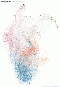
My friend Shawn Cunningham sent me an email with the visualization of his LinkedIn network and I was so fascinated that I had to see my network. The tool that does the visualization is called LinkedIn Maps. You can click on the map to enlarge it. Here is a link if you want to do your own network.
 What’s the most fascinating thing about the map? Well, for one it shows the power of visualization. Individual parts of the network are shown in different colors and you can label them. I found networks that are composed of people I know from my work in the field of market facilitation, others from my work in Bangladesh or professional colleagues in Switzerland. That’s not really a new insight, but the visualization just makes it so much more clear and accessible.
This is exactly why I like causal loop diagrams. Although they might not be able to be used as model to predict how a system is behaving, they still help us to understand the structure of a system.
Another thing I can find on the visualization of the network are connections between people I haven’t known that they were connected. Also the network structure is interesting. Especially the blue network in the bottom has a clear hub, the other networks are more distributed.
I haven’t really done a lot of work in network theory but it is definitely a field that interests me since it is so strongly connected to (or even part of) complexity sciences. I shall take more time to read.
